Friday, August 24, 2012

Shots from the Grand Opening

Wow!  What an evening!  Sorry to take an extra day to get up the pictures from the Grand Opening, but you know how darkroom work is -- it always takes more time than you think it will. . . . Anyhow, here they are, at last, just a handful of shots from the long-awaited museum opening night.

Evan arrives with a portfolio of huge prints, just in time for eats!  The wine is open and poured and the guests have begun to arrive.
Looking around the room, Evan finds that Kate has set down her glass of wine, once again ready to show off one of our two stereoscopes.  Is that an 1890 slide from Paris that she's got in there now?  Whatever it is, you can bet that Kate, who was the driving force behind the whole museum project, will know absolutely everything about it!
Our new (old) projector was a real hit.  It's a one-of-a-kind and in mint condition.  On the antique blanket chest behind it, you can see our other stereoscope.
"It's not right unless it's absolutely perfect."  We're pretty sure that's Ron's motto -- if he has one.  Here he's adjusting the shades to give just the right balance of reflected light in our second floor studio area.  At times, we've cursed Ron's perfectionism -- it always makes us work a lot harder.  In the end, though, we've got a much better product and are thankful for his eagle eye.  That's Bear on the floor, watching his every move.
For a limited time, guests will be allowed to explore the third floor R & R area -- mainly because we've run out of wall space on the first two floors and if you're coming to The Red Door Museum, you've simply got to see the Niepce print that started it all.
Thank you all for joining us last night!  It was great to see everyone and we hope to see you again soon!

Tuesday, August 21, 2012

Grand Opening Tomorrow Evening! Come by for the Wine, the Cheese, and a Wonderful Trip Through the History of Photography.

As you might guess, we've been really pushing to get everything ready for tonight's Grand Opening!  Before I start with the pictures show, though, I want to be sure to invite one and all to attend.  Wine, cheese, beautiful old photographs and one special new equipment acquisition.  Please do drop by!

So, here you go.  In the days leading up to this evening, we took quite a few images of our lovely museum to show off the art work before the crowds arrive.  Here's a taste of what's in store for you.

Some of our latest acquisitions.  How many can you identify?
We acquired this wonderful projector, along with four slide carriers (with slides!) at an estate sale.  It was a real find.
Evan admires Gertrude Kassebier's lovely 1899 image, Blessed Art Thou Among Women.
Kate shows off one of our two stereoscopes.  We also have an impressive collection of slides for them.  Behind her are four iconic images.  From top left going clockwise:  Cartier-Bresson's Derrière la gare Saint-Lazare, Paris, 1932; Dorothea Lange's immortal Migrant Mother, 1936; and Andrei Kertesz' Pont Neuf, 1931.  Partially visible is also Talbot's Latticed Window, 1830.
On the second floor walls, you'll find (from top left, then down, then right) David Octavius Hill and Robert Adamson's Newhaven Fishwife, ca. 1843-1847; an Edward S. Curtis' image from The North American Indian, ca.1907-1930; Marcia Bhide's Can I Play Too, 2008; and Frederick's Photographic Temple of Art, New York City, photographer unknown, ca. 1850.  On the floor, waiting to be archived, are a few extra reproductions of images on our walls.
Also on the ground floor:  Julia Margaret Cameron's portrait of Julia Jackson, 1867 (top); and the wonderful Alfred Steiglitz portrait of Georgia O'Keefe, 1918.
Once we add the planned annex, these photographs will move to the new ground floor space.  For now, on the third floor, you won't want to miss (from left) the photograph that started it all -- Joseph Nicéphore Niépce's View from the Window at le Gras, 1826; Jacob Riis' muckracking image, Mullen's Alley, 1888; and Daguerre's long exposure of  The Boulevard du Temple, 1838.
And there are even more wonderful photographs!  Be sure to come to the Grand Opening tomorrow evening.  We'll be waiting for you!

Tuesday, July 24, 2012

Getting Ready for the Grand Opening!


Well, the "sign guy" finally finished with the banner for the planned Grand Opening of the Red Door Museum.  Naturally, the night after he put it up, it rained.  So, it's just a little droopy, but still quite readable, and we are hoping it will attract lots of folks to the Grand Opening.

For the mini building enthusiasts out there, here's how the banner, printed on white cotton, was made:

Using a technique I learned from a fine art photographer friend, I was able to print out the banner with my ink jet printer on some plain, white cotton fabric.  It's actually a lot easier than you might think.  You just need to get hold of some nice, clean butcher paper (available in rolls from many art supply stores).  Butcher paper has a waxy coating on one side that will melt when you heat it.  First, cut a piece of butcher paper down to the size you want to print; in this case, I used the standard 8.5" x 11" that my printer was already set for and cut it with a craft knife.  You want the edges to be as clean and straight as possible, so it's best to use a metal straight edge as your guide with a cutting mat below.  Since my fabric was cleanly cut (it was a square cut especially for quilters), I could lay the paper flush along two of the edges.  Set your iron to the highest DRY setting (steam will make the paper wrinkle up) and let it pre-heat.  Then carefully iron the paper on to your fabric.  I found it works best to iron the paper rather than the fabric.  Pay special attention to the edge that will go into the printer first.  You want a tight bond along that edge; otherwise, the printer mechanism will pull at the fabric and you'll end up with problems.

Once the paper and fabric are bonded together, use a rotary cutting wheel (available and craft and fabric stores in the quilting section) and a metal straight edge to cut remaining fabric edges.  Now you have a standard paper size to feed through your printer.  You'll want the printer to print directly on to the fabric, so be sure you know which side your particular printer prints on.  My Canon prints so that I can put the printable side in the hopper facing me, but I used to have an HP printer that had to have the printable side facing down.  Put the fabric/paper into the tray where you usually put your stack of blank paper and just print normally.  If you can adjust the settings, print on the highest quality setting available.  Then print just as you would any blank piece of paper.
This is the sign as it came out of the printer!  Pretty easy, really.  To create the design, I used Photoshop.  I also included some cutting lines that will guide me when I cut out the banner, but won't show in the final piece.  At this point, you can peel away the paper backing and discard it.
Here I'm cutting out the banner, using my rotary cutter and a handy transparent acrylic guide that Fiskar makes especially for quilters.

I wanted to give my banner a texture more like canvas might have, and also wanted to help protect the printing, which is not waterproof.  If you get the printed fabric wet, the ink will run -- a lot!  I had a can of spray polyurethane out in the garage so, after separating the fabric from the backing, I sprayed it front and back with a fairly heavy coat to help seal the ink and give the fabric body.  Then I discovered (gotta love serendipity!) that it also made it possible to pinch and form the fabric to get it to hang as though it had been out in the weather!  Once I had it formed into a shape I liked, I attached it to the building with some tiny nails from miniatures.com.

And Voila!

Thursday, July 19, 2012

Smokin' Hot Addition


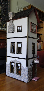
Ever since adding the pot-bellied stove to the third floor, it has been bothering me that, while there's a stove pipe going to the wall, it has no matching pipe or chimney on the outside.  I suppose it's what in television or the movies they'd call a continuity error (like when you spot a princess phone from the 1960's on a desk in a story set in the 1940's).  Finally, I decided to correct my miniature continuity error and add a chimney to the outside of the building.

Not knowing how chimneys were really constructed, I began by pawing through my scrap wood bin, pulling out bits of wood and letting my mind wander, trying to visualize the chimney and work through mentally the logistics of adding it to an essentially finished piece.  As the pictures started to form in my head, I began cutting and arranging bits of wood on my work table.

I rarely measure anything -- it just doesn't work well for me.  I'm always off just a little bit somewhere.  Instead, I generally cut and fit as I go along.  However, this time I did have to at least measure for the overall size of the largest portion of the unit.  After that, it was more a matter of seeing which bits of wood could be used where and finding/cutting enough matching strips to build up the sides and make the whole thing stable.
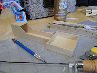
Here's the completed form.  It's shallow in the area that will be mounted to the wall of the building, but then slopes out at 45 degrees to form the chimney portion that will be above the roof line.  After forming the rectangular portion of the box, I added smaller slats to the sides to form the "shoulders" of the chimney.  Since I don't have a mitering tool that will cut a piece this wide while the piece is standing on end, I used a utility knife to whittle the ends to the proper shape.  Since the entire unit will be covered by stone and mortar, it was less important than it usually would be to have an exact fit.
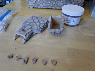
One of the advantages of following a pattern when building a piece is that it means someone else has already dealt with the odd little problems that will come up.  In this case, the best way to get the chimney to go through the roof, which is made of a very tough (and hard to cut) fiberboard material, covered with cedar shingles.  Because my brain often starts out by thinking in life-sized mode, it took me a while to realize that there wouldn't actually be smoke coming from the stove and the chimney didn't really have to go through the roof.  It only needed to appear to do so.  So, using a coping saw, and following the 45 degree angle already established, I cut the piece into two sections.  In this photo, you can also see where I've used a utility knife to cut away portions of the roof shingle so I can embed the top portion of the chimney in the roof.
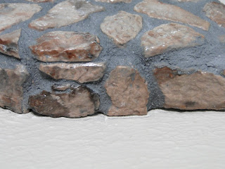
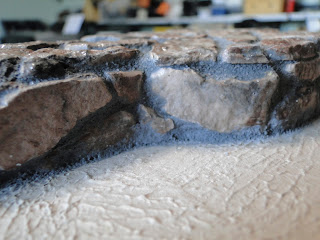
I've applied the mortar to the glued-on stone (Alene's Tacky Glue), and applied the mortar.  Once the glue is dry, but before troweling in the mortar, I brushed on a coat of semi-gloss polyurethane, which both protects the soft plaster "stones" and brings out their colors. I use a plastic artist's palette knife as a trowel, making sure that the space between the stones is well covered.  Then, after scraping away as much excess mortar as possible with my "trowel", I use a damp sponge to wipe away the residue, leaving the stone exposed and the mortar between smoothed out.  The sponge has to be rinsed and squeezed out repeatedly during the cleaning process.  It's exactly the same process you would use to grout full-size bathroom or kitchen tiles.
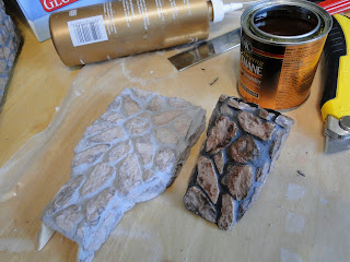
Here, the two sections have been covered with stone left over from doing the stonework on the first floor.  On the left, the stone has been glued to the base and mortar forced between the stones.  The next step is to apply two more coats of polyurethane.  I used semi-gloss again here.  The polyurethane helps harden and protect the stone (which is made from colored and molded plaster), as well as bringing out the colors in the stone.  On the right, the stones and mortar have received  one coat of polyurethane, while the section on the left is still waiting for its coat of polyurethane.  The gloss of the coating darkens the mortar mix along with the stone, but the finish of the mortar stays dull, while the stones take on a slightly polished look.  The finish lightens a bit as it dries.
After gluing the unit to the wall, I didn't like the look of it.  It was just too -- well -- too pasted-on looking.

Using a pediatric dosing syringe with about half of the tip cut off, which I filled with mortar (using a popsicle stick to stuff it in the syringe tube), I ran a bead of mortar along the join between the wall and the chimney.
Using a clean popsicle stick, I smoothed the mortar into the crack and wiped it with a damp sponge.  The end result is a chimney that looks more like an integral part of the structure.


After painting the bare roof rectangle with flat black acrylic and doing the same to the inside of the chimney, I added a strip of copper to the bottom so simulate flashing.  Then I glued the chimney to the roof.  And, voila!  Continuity error resolved!


Sunday, July 1, 2012

The Red Door Photography Museum Gets a Little Exposure

Building The Red Door Museum was begun as part of a build-along project in which dozens of participants, using the same basic materials, let their imaginations soar.  The project deadline was June 1st, at which time we posted images of our work to the Real Good Toys web site and also to their Facebook page.  It was exciting and interesting to see all the different directions people took with the pieces of pressed wood in the dollhouse puzzle kit.

This morning, I opened my e-mail to discover that Real Good Toys had used my Red Door Museum as the "cover art" for the links to the two galleries!  How fitting that a photography museum should get a little exposure!  Thanks RGT! 
Build-Along Project
Finished Pictures
Marcia Bhides Red Door Museum
Marcia Bhide's
Red Door Museum
The pictures are in and we've posted them on our Facebook page as well as our Photo Gallery on the Real Good Toys website.  Make sure to stop by and check them out.  We have some very creative and amazing miniaturists in our midst.

A sincere thank you to everybody who participated in the 2012 Build-Along Project.  We couldn't have done it without your support.

For those of you who didn't make the deadline, feel free to email me your pictures when you've finished and I will be happy to add them to both albums.  Everybody would love to see what you've been up to!  Email to jennifer@realgoodtoys.com

Friday, June 1, 2012

The Work in Progress Finally Looks More Like a Work and Less Like Just Progress

I began the museum as part of a "build-along" project on line.  The deadline for completion was today, June 1st, but I know I'll be working and re-working this project for quite a while.  It is a museum, after all, and museums have changing displays. . . .

While the second floor studio still needs quite a lot of work -- like a nice camera on a tripod, for example -- the place really is beginning to look presentable.  The museum will represent photography from the original image by Joseph Nicephore Niepce through about the 1930's  (with one notable exception, which I'll tell you about later).  See what you think.

I'm thinking of putting large billboard style images on the third floor blank walls.


The first floor main gallery area.  On the table on the right, you'll find a stereoscope with pictures and a stack of cabinet prints from the late 1800's.

The second floor will eventually be a portrait studio
The third floor provides a few amenities for the photographers and staff


Wednesday, May 30, 2012

Tintypes!

I got five wonderful and wonderfully tiny tintypes from Genevieve at Boxlots on Etsy.com.  These lovely little tintypes were probably originally intended to be put into a locket or some similar keepsake item.  Each one measures approximately 1/2" x 3/4".  I couldn't bear the thought of framing them and losing all that great metallic feel.  Just sticking them to the wall didn't seem like a good solution, either.  So I decided they needed little easels.  Does anyone sell teeny, tiny little easels?  Of course not.

After a couple of failures, I eventually came up with a prototype that was workable.  Here's the result.  Let me know if you recognize anyone in the pictures!